It is a known fact that renters move. Some more than others, and sometimes it’s a happy move (moving for making more $, larger family, better weather) and sometimes, well, it’s not.
Landlords, in their search for utopia, want renters who (1) keep paying them higher rent every year than the year before (2) pay their rent on time (3) don’t wreck the place and (4) stay for extended periods of time. Utopia may not exist, but thankfully data science does. It can not make you young, taller, but it can find patterns about why people move, and once known, can predict when someone is likely to move.
In our quest for THAT answer, Beekin data science analyzed 5 million renters using their mobility data, rent data sourced from 12 different public and private datasets. A few months of hard work, but some cool results that we feel pretty excited about.
We found resoundingly similar patterns across cities, and an understanding of when people are likely to move which depends on both their demographics, the property as well as the area they live in. Duh, but wait, this is a quantitative model versus a judgement.
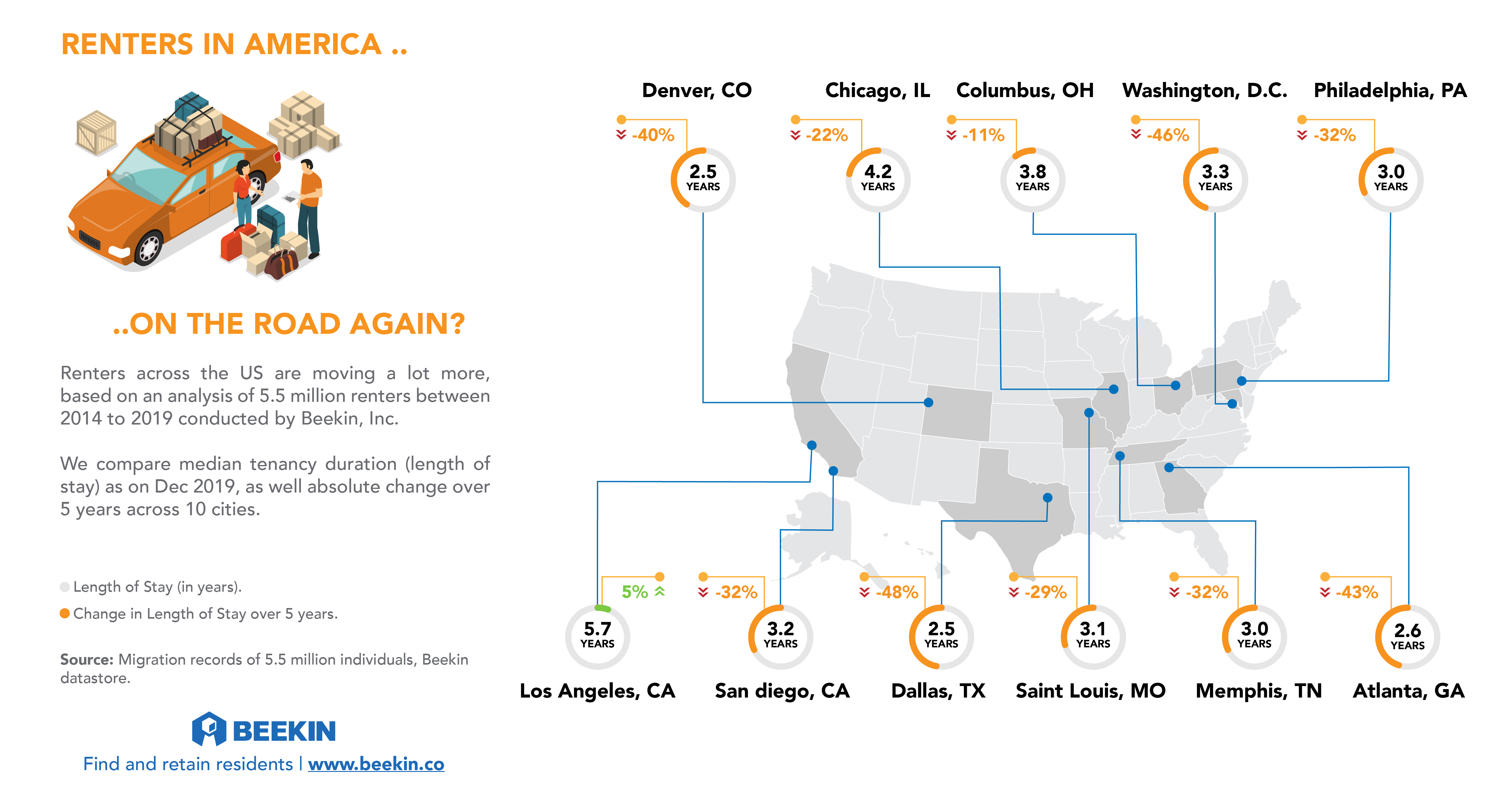
In the first part of a 3 part series, we output the renter tenure or length of stay across a few cities in the United States. This helps guide both investment and asset management decisions.
Overall – Los Angeles did well compared to most cities, with renters staying for an average of 5.7 years and an increasing rental tenure. We’ll get back to why that could be in a bit.
In contrast, most cities saw a marked drop in rental tenure over the past 5 years. This is proven and probable: things like lifestyle changes, job transitions and new rental housing stock in these cities all contribute to people moving a lot more.
Interestingly, all of the cities with falling tenure have seen strong net migration as well as net new construction starts. Specifically, people moved a lot more into – Dallas, Denver, Atlanta, Washington D.C.

A snapshot of 2018 Census data below, shows us in-state moves and moves into the state (net migration %). With some obvious skews (D.C. as a state is small, but people live in VA, MD), there is a visible trend toward the sunbelt states.
The graph below shows you how many people lived in the same house 1 year ago, how many moved in-state and a % of out-of-state and international migrants in as a proportion of state population.

In the spirit of compliance, while understanding these relationships, Beekin data science “muted” variables which could be considered discriminatory including marital or family status, ethnicity or race. The results are robust, fair and scalable. And if done right, can lead to a happy renter and happy landlord.
Hope you have fun using them.